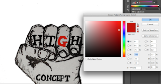
Out of the 3 original ideas we have chosen this one because we think it is the most striking and powerful and really highlights the genre of film we have made - an action thriller, the first to depicts violence and action. The colour scheme we have gone for was chosen because we thought the red colour would real emphasise even further the action and violence involved in the film. When the audience see the colour red they will instantly relate it to blood and will instantly know the film genre. In order to convert the original drawings into a graphicly designed uimage we have used Photoshop CS6 and by doing so we have been able to edit colour schemes and remove the orignial 'paper' background to make the fist more imposing.


No comments:
Post a Comment